We shall not cease from exploration
And the end of all our exploring
Will be to arrive where we started
And know the place for the first time.
"Little Gidding"
T S Eliot

Thursday, 24 November 2016

My sister and me ...

My sister, Laura, is a wood turner, making all sorts of (mainly small) delicious things. Her lathe is in a 6 x 4 unheated shed, which can prove problematic in the winter months! She has recently set up an Etsy shop, so you can see her creations here.

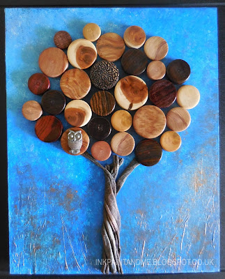
Anyway, at the end of each session on her trusty lathe, there is this small disc of wood, which she polishes and puts into a little box.

Well - I couldn't pass up the challenge of doing something with them!

I've used a wooden box frame, with acrylic paint for the background, a bit of texture created with the gesso layer, and copper gilding wax. The tree truck is made from fabric dunked in fabric hardener (Powertex). I've also added a little airdry clay owl. We called this creation Watcher in the Wood ...


Since Laura has been wood turning, I've learned so much about wood, and the amazing array of colours you find beneath the bark.

Sticking with a tree theme, this from Emily Dickinson makes me smile -

Not at Home to Callers
Says the Naked Tree -
Bonnet due in April -
Wishing you Good Day -

Thursday, 17 November 2016

I'm out to impress you!

There are only a few letters to go in this year's Craft Barn Alpha Dictionary challenge, and I've managed to stick with it!  This time the letter is I.

I wanted to impress you with an alternative definition of that word!

The background is some spray inks with cling film scrunched on top to create a random pattern. I then found some metallic effect sticky backed stuff and die cut and embossed (or impressed) the butterfly.

I've also got a set of metal sticks with the alphabet letters on the end which you hammer into a surface to impress the letter. You can just about see the letters.


I think there are 4 letters to go - just hope I don't get brain freeze as the weather seems to be turning colder now!

Loving all the autumn colours against blue skies, just a perfect combination.

Saturday, 12 November 2016

Prime time!

I've finally finished the second primary layering exercise that I started a couple of weeks ago in my art class.

Primary layering is mixing primary colours on the paper - each layer must be dry before doing the next layer.

All the layers (I did about 20), were done wet into wet.


First, yellow - there is about 3 layers here ...


Then red - probably 5 layers ...


Before I started on the blue, I did some adjustments with more yellow and red layers. There is an impression of a roof, and I had to remember to lift out the paint after each layer! I didn't use masking fluid as it had to remain quite soft.

I then added blue layers, before painting in some trees.

I made final adjustments with some more red and blue layers.

This looks quite Turner-esque to me!


I love the softness of wet in wet multiple washes, and primary layering is a fantastic technique to do, all you need is a little patience - so have a go!

It is only when we are no longer fearful
that we begin to create.
JMW Turner

Saturday, 5 November 2016

An ultra celebration ...

The Craft Barn's next dictionary challenge letter is U.

As I'm currently learning about primary layering in my art class, and as it is my all time favourite colour - I've chosen Ultramarine.

So this is a bit of an abstract celebration of ultramarine, on watercolour paper, with ink and ultramarine paint (in graduated steps) with a bit of coloured pencil too. I've also added some sparkle with glitter glue.


It is the most used colour in my six colour palette, and I'm already on my 3rd tube of the stuff!

Its history ...
Ultramarine is a deep blue colour and a pigment which was originally made by grinding lapis lazuli into a powder. The name comes from the Latin ultramarinus, literally "beyond the sea", because the pigment was imported into Europe from mines in Afghanistan by Italian traders during the 14th and 15th centuries.
Ultramarine was the finest and most expensive blue used by Renaissance painters. It was often used for the robes of the Virgin Mary, and symbolized holiness and humility. It remained an extremely expensive pigment until a synthetic ultramarine was invented in 1826.